Website design has changed dramatically over the last decade, but since using the web is so part of our every day lives, we rarely take a moment to appreciate it. In 2019, we are a lot more critical at the websites we choose to look at and have much higher standards than before. However, surprisingly some of the most successful Internet giants continue to use their basic formats including Google, Amazon and eBay. But from a consumer perspective, so much has changed, as TechRound explains below.
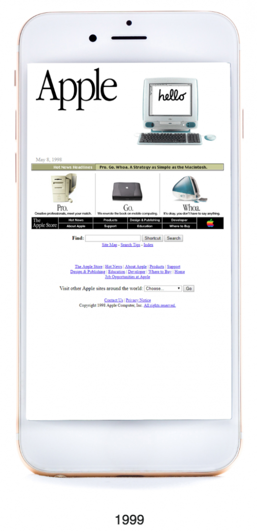
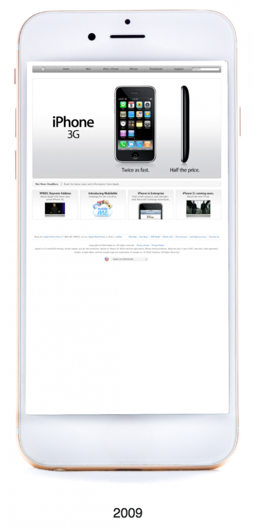
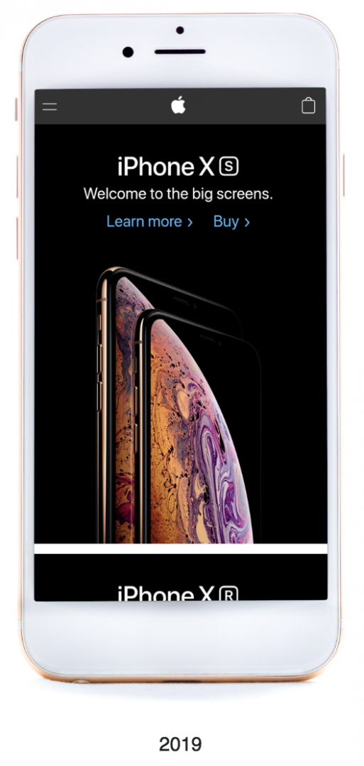
Firstly, here are some interesting changes to Apple’s website in the last 20 years.
Better graphics
Graphics have come a long way, from using basic HTML to all different types of code today including Java, CSS, HTML5, Drupal and more. The early days of the web were very text heavy and having a video on the site would have been unheard of in 1999. But today, it is very visual.
More from Guides
- Top Alternatives To Dropbox
- How to Use AI to Create Investor Reports
- Can You Measure Productivity Objectively?
- What Do I Need To Do To Use A Payroll System?
- Why Professional Printing Services Can Be Important For Business
- Mental Health At Work: HR’s Role In Supporting Employees
- 10 Ways AI Is Changing What Talent Looks Like in Commodity Markets
- Best Alternatives To WhatsApp
Better quality images
Whilst stock images still creep into the world wide web of today, the early days were all about stock images. But today, the average user sees right through this and there is more emphasis on real images, copyrighted images and high res photos to add a lot more sophistication to a website.
More mobile focused
Google have acknowledged that there are more users on mobile phones than on a desktop and the search engine now indexes a mobile version of a site first. This has caused design and development agencies like Clay.Global as well as online brands to be more creative with their mobile designs, creating hamburger menus to condense information, and trying align all the relevant information in a screen, creating swiping actions and making sure that information is accessible via touch screen.

Quality over quantity
Less is certainly more in 2019. No need to overkill with lots of words and content, both for SEO or to impress the user. Today, we are far more interested in strong imagery and bullet point information.
Less flashing and bright colours
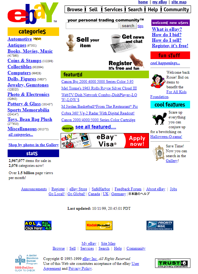
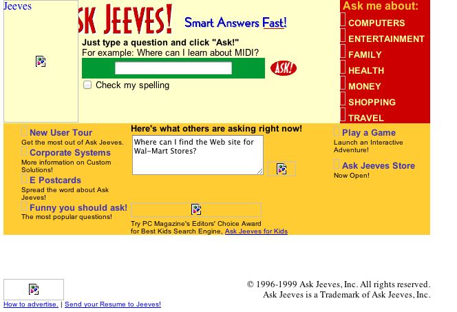
The early days of the web were filled with pop ups, flashing banners, large arrows and call-to-action buttons. Were we idiots or something? Some sites (especially in the US) are still encouraging this type of user experience, but today, it is a lot more subtle with the colours and the flashing buttons have been toned down.
Popular designs in the early days saw a black background and white text, sometimes multiple colours on a website. But this is more or less unheard of today. You are far more likely to see black text on a white background – and sometimes only two to three colours used as part of the palette.
More emphasis on protecting data
There was very little respect for personal or private data in the early days and websites would not always have terms and conditions. In terms of junk mail, for many, this was out of control as your data was sold onto provider to provider for basic things or every time you applied for a financial product or casino.
Today, following stricter laws surrounding in and the cookie policy laws, you are always likely to see terms and conditions and privacy policies on the footer of a website, a pop up or some respect for your cookies or personal data – and any other information to show that your details are kept safe.


