

Coca-Cola sold more than 250 million bottles and cans with first names on them in Australia in a single summer, in a country of fewer than 23 million people. The drink inside hadn’t changed at all, only the label had and now all of a sudden people were hunting through fridges for their friends’ names.
Some brands have made the packaging itself memorable, whether that means putting someone’s name on a bottle, printing millions of different designs on jars or turning a delivery pouch into something customers actually want to keep. Others have used packaging to solve a practical problem, from opening a product with limited dexterity to making a box accessible to someone using one hand
When Packaging Becomes Part Of The Marketing
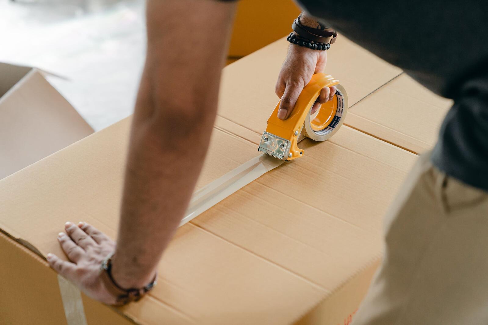
Packaging is usually the first part of a product you physically hold, and with online orders, it’s often the first thing you see before you even get to the product. In a shop, it has to catch someone’s attention without a salesperson standing next to it explaining why they should care, so colour, shape and wording have to do the work.
Unboxing videos have turned opening a parcel into content, meaning the customer can end up doing the advertising while the packaging gets its moment on camera; which isn’t a bad result for something that was only supposed to hold the product.
Packaging People Keep, Film And Talk About
A bottle or carton can stay in someone’s hands or on their table far longer than an advert stays on their screen. Something that gets opened every morning, carried around in a bag or left on a bathroom shelf keeps getting seen, so a name, illustration or joke printed on it gets another appearance every time.
Packaging can also give people something to talk about that the product itself can’t. Someone can show off a funny carton, compare a personalised can with a friend’s or post the pink bag their order arrived in – the formula inside the bottle doesn’t exactly make for thrilling Instagram content, but the packaging most certainly could.
More from Business
- Why Do Economic Downturns Sometimes Create Startup Booms?
- Big Businesses Are Losing Track Of Billions In Contract Value, So What’s Going Wrong?
- Why The Reception Desk Is Becoming A Digital Experience
- What Is Germany Doing To Attract More Businesses?
- Padel Is Turning Empty Spaces Into Businesses, Here’s How
- Top Luxury-Tech And Commerce Startups In France To Watch In 2027
- What Is The Netherlands Doing To Attract More Entrepreneurs?
- Quite Contrary: Most GEO Advice Is Just Repackaged SEO, According To Harpal Singh
1. Coca-Cola: The Bottle With Your Name On It
Share a Coke began in Australia in 2011, when Coca-Cola swapped its usual branding for the 150 most popular first names in the country. Nicknames such as “BFF” were later added for people whose names didn’t make the cut, and the campaign eventually spread to more than 80 countries.
Putting names on the bottles gave people a reason to look for a specific Coke can and more importantly, someone else to buy it for. Finding your own name was the hook, but finding your friend’s and handing it to them turned a bottle of Coke into a tiny personalised gift.
2. Martinelli’s: The Apple Juice Bottle That Sounds Like An Apple
Martinelli’s apple juice comes in a small, apple-shaped plastic bottle, but its packaging became much more famous for something nobody was expecting. In 2020, people on TikTok started biting the emptying bottles and discovered that the plastic made a surprisingly convincing crunching sound, much like biting into a real apple. The bottles are made with multiple layers of plastic, which helps create the noise when they are squeezed or bitten.
The #AppleJuiceChallenge spread across TikTok, with people filming themselves testing the bottles to see if the sound was actually real. Martinelli’s even acknowledged the trend, although the company was clear that it didn’t recommend biting the packaging – we obviously still didn’t listen.
3. Oatly: Cartons That Talk Back
Oatly’s cartons are covered in chatty copy, jokes and little bits of writing about the company, giving you plenty to read while your cereal is going soggy. The agency behind the redesign, Forsman & Bodenfors, said Oatly had a limited media budget, so the packaging became one of its main advertising spaces.
John Schoolcraft, Oatly’s chief creative officer from 2012 to 2025, has described the thinking as making sure every side of the pack had something interesting to read. Instead of looking like a carton that desperately wants you to know its nutritional information, it reads more like someone at the company has been allowed to write whatever they fancy.
4. Liquid Death: Water With A Skull On It
Liquid Death sells water in tallboy aluminium cans covered with a melting skull and the slogan “Murder Your Thirst”. Founder Mike Cessario has said the idea partly came from seeing musicians who preferred water on stage pour it into energy drink cans because they didn’t want to look uncool drinking water.
The company says it has reached $263 million in global sales across 113,000 retail outlets in the US. The can looks more suited to a bar than a fridge full of bottled water, which was very much the point. It’s still water, but the packaging gives it an identity that a clear plastic bottle with a mountain on it probably wasn’t going to manage.
5. Rare Beauty: Packaging Built Around Hands That Struggle With Caps
Selena Gomez launched Rare Beauty in 2020, with packaging that was developed around her experience with lupus and arthritis in her hands. The caps and bottles were designed to be easier to grip and open, after the team worked on making them more accessible.
Customers noticed before the brand made accessibility a bigger part of its public messaging. Fast Company reported that people were commenting online about how easy the packaging was to grip and open, with the Soft Pinch Liquid Blush cap getting particular attention because it required very little force.
That eventually led to Rare Beauty’s Made Accessible initiative, which looks at things such as grip, resistance, bottle size and how products can be held and applied by people with limited dexterity. Their perfume bottle, for example, was developed with hand therapists, which turned something as ordinary a “normal” beauty product into part of the brand’s identity.
6. Guide Beauty: Tools Shaped Around The Hand
Guide Beauty – a brand similar to Rare Beauty – was founded by make-up artist Terri Bryant, who developed dexterity problems in her hands and was later diagnosed with Parkinson’s disease. That experience led her to develop make-up products designed to be easier to hold and apply.
The brushes and eyeliner tools have rounded bases that sit in the hand and provide a more secure grip. There isn’t much mystery about what makes the products different; you pick one up and can immediately feel that the shape wasn’t chosen because someone thought it looked pretty in a presentation deck.
7. Xbox Adaptive Controller: A Box You Can Open With One Hand
Microsoft says the packaging for the Xbox Adaptive Controller was the first it had designed specifically around accessibility. The box needed to let gamers using one hand or arm open it and remove the controller without needing someone else to help.
A loop on the outside of the shipping box can be pulled to remove the sealing tape, while the inside avoids twist ties and zip cords. Gamers with disabilities tested prototypes during development, so the accessibility wasn’t something added after the packaging had already been designed.
8. Benefit Cosmetics: Pin-Ups And Puns
Benefit was founded in San Francisco in 1976 by twin sisters Jean and Jane Ford, and the brand’s packaging and product names have long been part of its identity. Bright colours and pin-up style illustrations run across the range, making a Benefit product recognisable on a bathroom shelf before you’ve even read the label.
Then there are the names; a mascara called They’re Real! sits next to a primer called Porefessional, while the retro illustrations keep the range looking like it belongs together.
It’s pretty hard to mistake a Benefit product for something from a clinical skincare brand, which is really helpful when half the battle in a crowded beauty aisle is getting someone to notice you in the first place.
9. Glossier: The Pink Pouch
Glossier orders arrive in a pink bubble wrap pouch that customers often keep and reuse for make-up, travel or whatever else fits inside. The packaging has continued to appear in photos even after the products have been taken out, giving the pouch a second life as a recognisable bit of the brand.
Glossier even tried to trademark the pouch and its pink-lined shipping boxes. The US Trademark Office refused the application, arguing that the bubble wrap pouches were functional and the pink-lined boxes were decorative. Glossier pointed to customers’ social media posts as evidence that people already associated the packaging with the brand.
So basically, Glossier saw a piece of packaging becoming recognisable enough to protect as a trademark, while the trademark office essentially just saw a pink bag.
10. Lush: Naked Products And Black Pots
Lush says around half of its products can be taken home without packaging, which it calls going naked. For products that do need containers, its black pots have become part of the brand’s recognisable look.
There’s also a reason for customers to bring those pots back. In the UK and Ireland, the Bring It Back scheme gives customers 50p towards their shopping for each qualifying item they return, or a free face mask for every five.
The packaging policy therefore becomes something customers interact with at the till, instead of being a message they have to hunt for on the company’s website. Sometimes the most effective packaging strategy is apparently having less of it.
When The Packaging Does The Marketing For You
The best packaging can give people a reason to pick something up, remember it and ideally, tell someone else about it. Once that happens, the package isn’t sitting quietly around the product anymore – it’s doing some of the selling.
And sometimes, as Martinelli’s found out, the most effective marketing feature is the one nobody thought would become the main attraction.